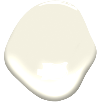
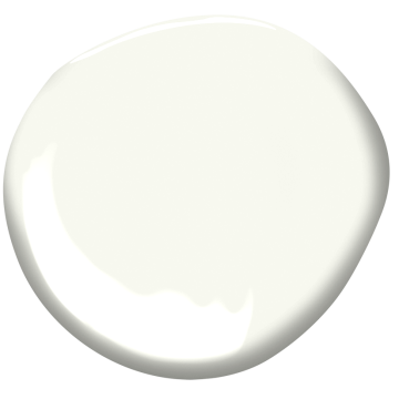
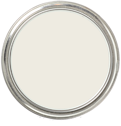
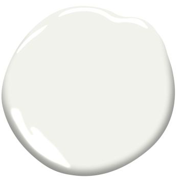
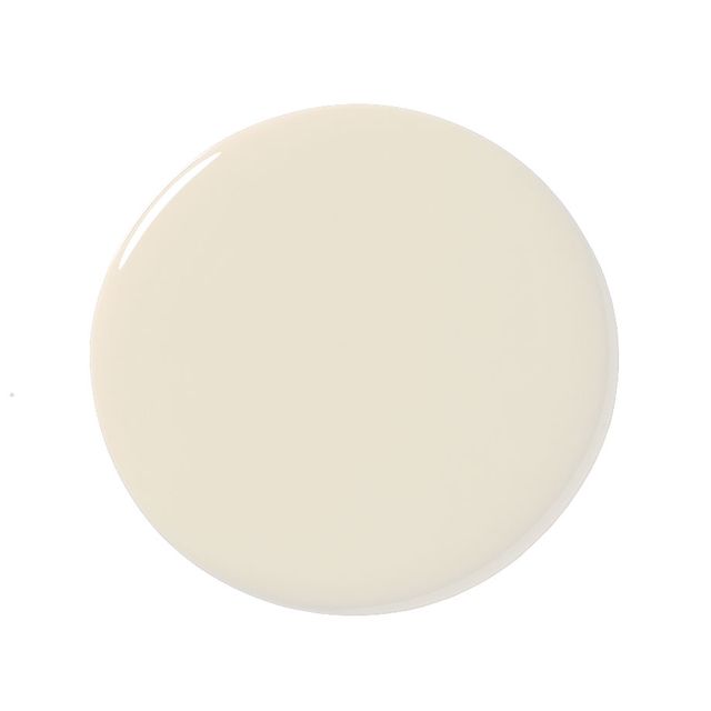
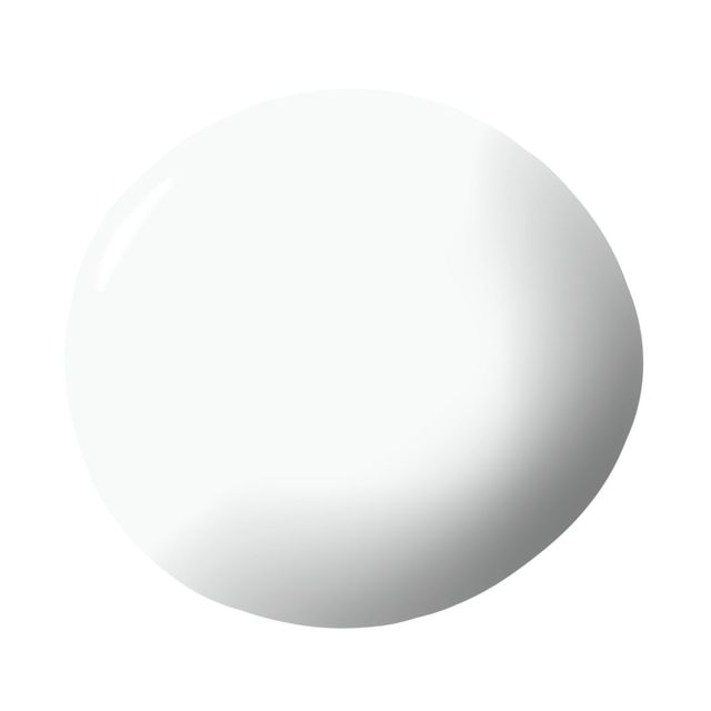
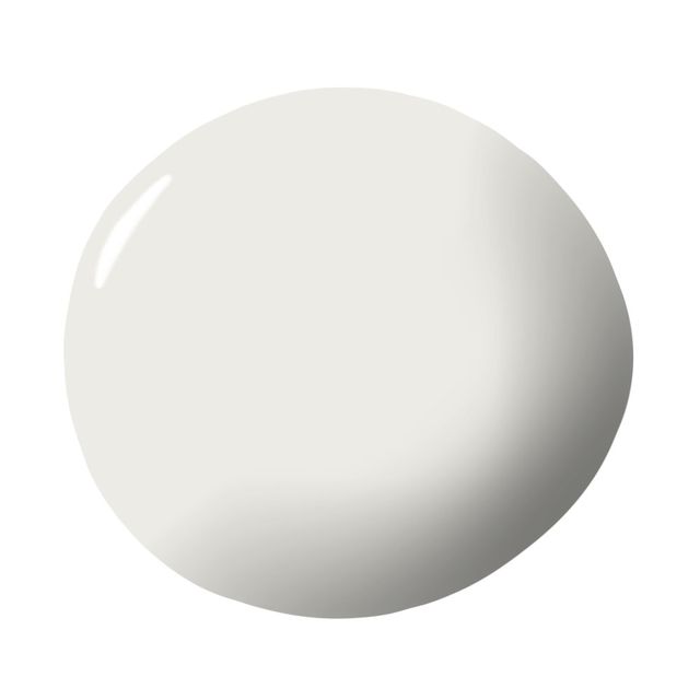
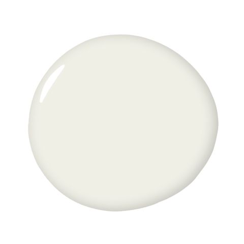
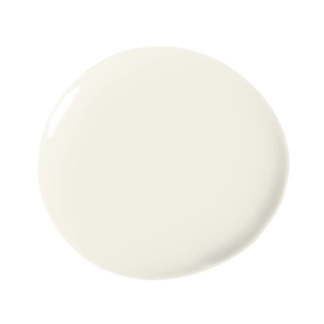
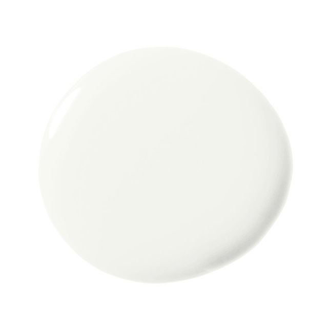
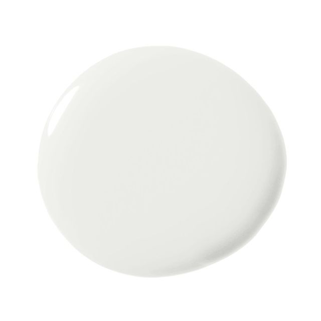
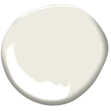
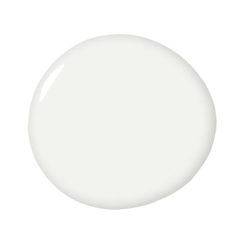
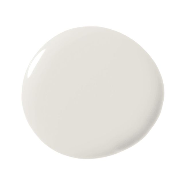
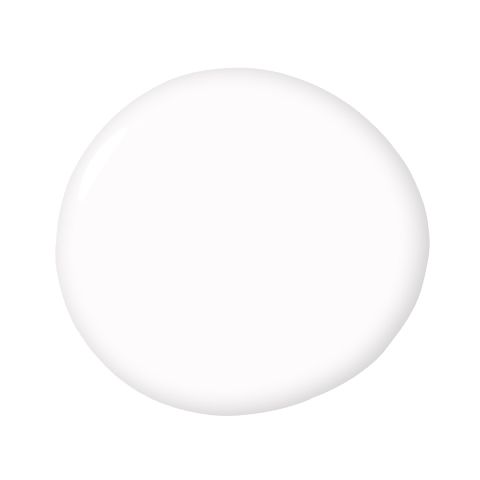
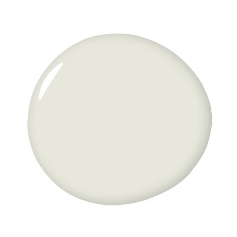
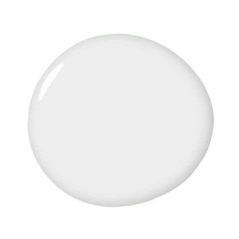
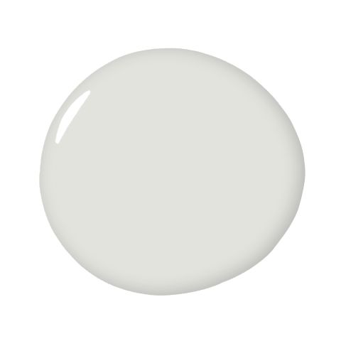
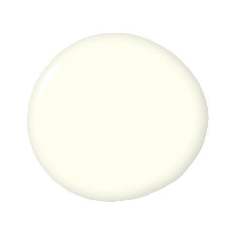
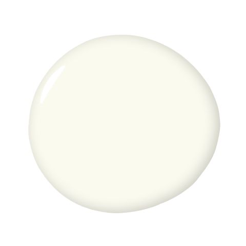
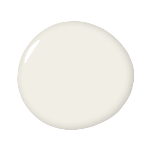
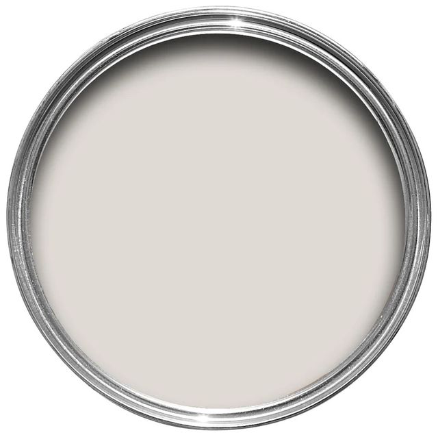
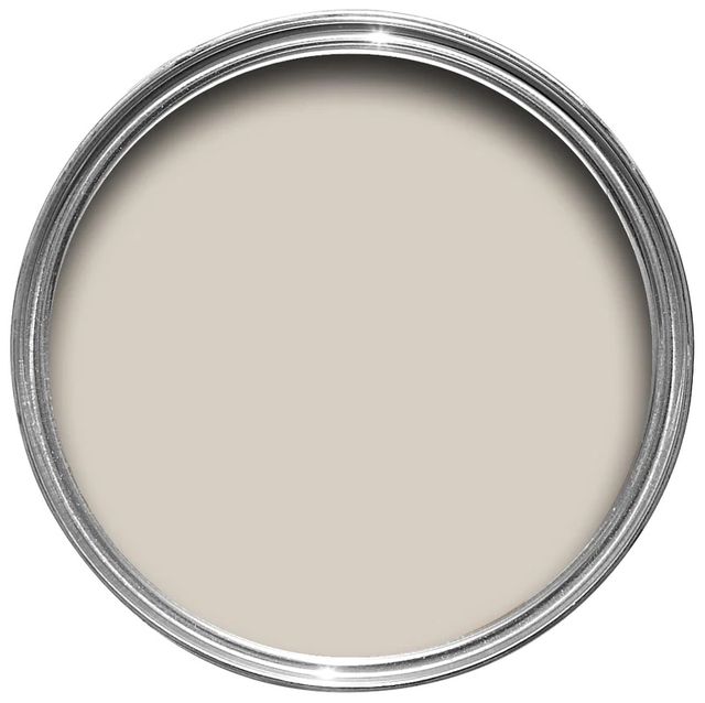
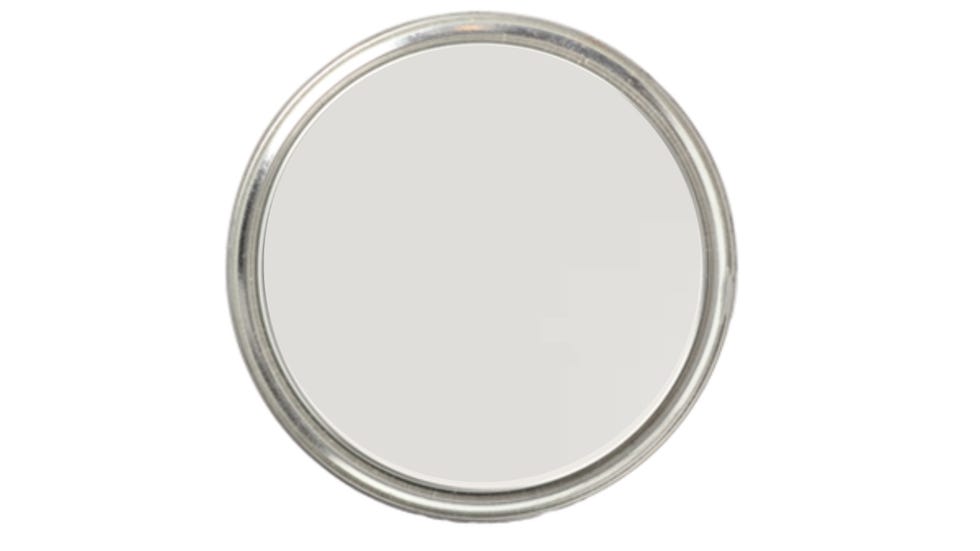
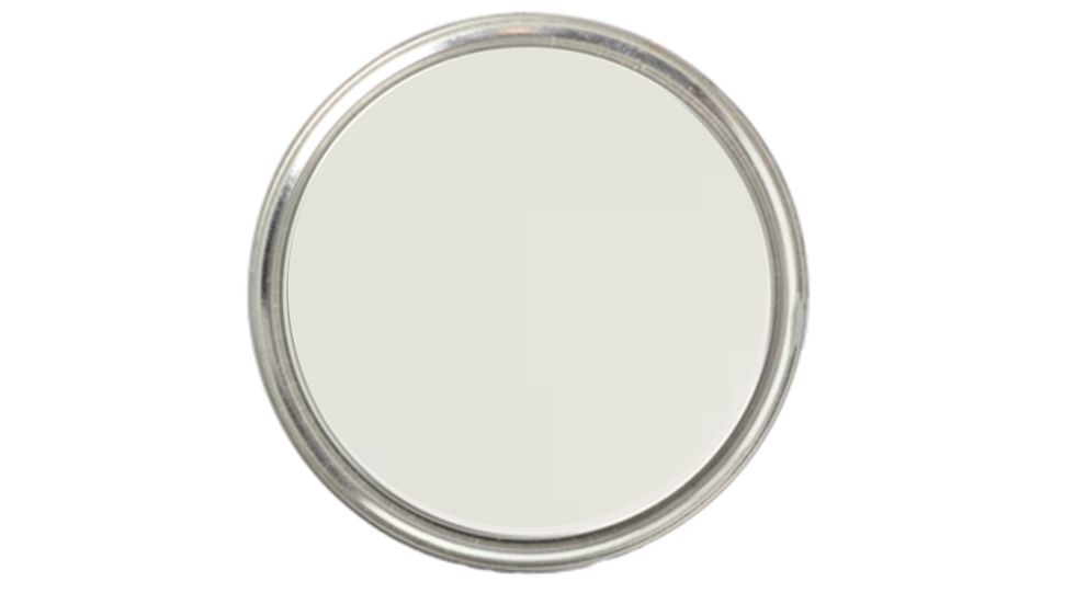
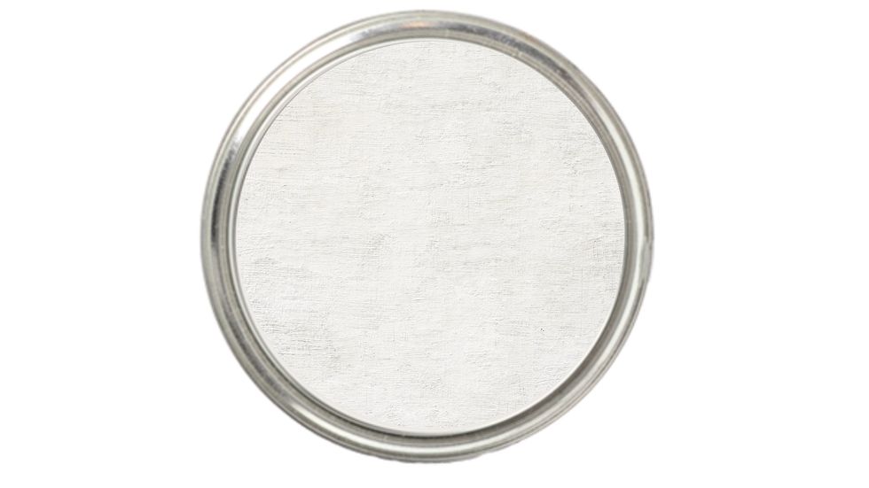
White can be assumed to be the classic fallback paint color, a failsafe default for kitchens, bedrooms, and bathrooms. But choosing the right hue for you and your space’s needs can be shockingly difficult. With so many nuances and undertones available, white isn’t just white anymore: It’s off-white, ecru, cream, ivory…must we go on? And just like every other color, the decision requires special consideration of architectural details, finishes, and lighting.
Just ask Patrick O’Donnell, color expert and Farrow & Ball’s brand ambassador, who holds that the color—or noncolor—has a calming effect in a room. “The color of purity, it is the very essence of projecting a clean and ordered environment,” O’Donnell says.
So where do you even begin to choose the perfect paint color? To help, top designers share the best shades of white and where to use them. With any luck, you’ll spend less time attempting to decipher the difference between two hues that are practically indistinguishable and spend more time enjoying your space.
How to Choose the Perfect White Paint Color
Before you start to browse paint decks and swatch your walls, it’s important to take stock of your space’s qualities, like the amount and direction of light coming into your room. “If it’s a north-facing room, a clean white will feel too chilly, so consider whites that have underlying red or yellow notes through them,” O’Donnell says. On the flip side, whites with cooler undertones will help balance out the intensity of the light in a south-facing room.
Another thing to consider? How your white in question will work with the rest of your color palette. “If using whites on your trim and moldings to go with your chosen wall color, think of a white that has underlying tonal notes of your wall color,” O’Donnell adds. “For a dark green such as Green Smoke, consider a slightly dirtier white with green undertones like Old White from our traditional neutrals; this will create a softer contrast than a ‘true’ white.” And before you commit to the look, consider what other elements will be in the space—from artwork to furniture pieces to boldly patterned drapes.
Once you’ve figured out the type of white your space needs, it’s time to peruse these top, designer-approved tones.
1) Sherwin-Williams Snowbound SW 7004
For a tried-and-true neutral that has chameleon tendencies, you can’t go wrong with Snowbound by Sherwin-Williams. “It’s one of my favorite whites because it’s warm without being too yellow,” explains Amy Leferink of Interior Impressions. “It has a very clean undertone—no green, blue, or pink hues.” Though it’ll look like a true white when solo, it’ll take on a greige tone when coupled with other hues.
2) Benjamin Moore Atrium White OC-145
Looking for the perfect pigment for a kid’s space? White may not be the first color that comes to mind, but Benjamin Moore’s Atrium White is designed to appeal to the entire family. “If you want your home to feel really calm and relaxing, I suggest using a white that has a creamy tone to it,” designer Michelle Gerson says. “Benjamin Moore’s Atrium White has a little bit of a peach tone.”
3) Dunn Edwards Cool December DEW383
There’s a reason why Cool December by Dunn Edwards has been Breegan Jane’s go-to white for 10 years and counting. “[It] strikes the perfect balance and always seems to do the trick for me,” the designer shares. “Plus, it’s touch-up-friendly and works well with Magic Erasers, [which is] important for moms like myself who have active kids.” Icy and bright, this option strikes a happy medium between cool and clinical.
4) Sherwin-Williams Moderne White SW 6168
White is a foolproof option for your kitchen—and the cool undertones of Moderne White by Sherwin-Williams will look squeaky clean and pure. To keep the look from going too sterile, designers and Moderne White fans Beth Dotolo and Carolina Gentry of Pulp Design Studios recommend pairing it with bolder hues. “We like to add a little twist to our mostly white kitchens, like with a burst of orange on a barstool or a boldly patterned backsplash,” the duo explains.
5) Benjamin Moore Ivory White 925
Pair your rich, wooden finishes with Benjamin Moore’s Ivory White, a creamy white that designer Christina Kim stands behind. “Sometimes you need a creamy white, which can be tough to get right. It’s easy to veer too yellow, [which is why] I really love Benjamin Moore’s Ivory White,” she says. “This creamy white works best when you envelop the room completely and paint the trim, walls, and ceiling in it.”
6) Benjamin Moore Snowfall White 2144-70
Don’t let its name fool you: Benjamin Moore’s Snowfall White will look good in any type of climate. As a crisp, icy white, this hue will perfectly reflect what’s outside. “For the perfect, crisp, icy white, we used Benjamin Moore Snowfall throughout this sky-high pied à terre,” shares Kendall Wilkinson. “When the signature San Franciscan fog rolls in, you feel like you are floating on a cloud.”
7) Sherwin-Williams Alabaster SW 7008
For Joelle Smith, the key to finding the perfect white is identifying the mood you want to create. If a cozy, welcoming space is what you’re going for, Alabaster by Sherwin-Williams has you covered. Mimi Meacham of Marian Louise Designs is also a fan: “It’s the perfect fresh, warm white. It doesn’t read too creamy but still falls soft and stays crisp.” Ready to create contrast? Smith loves to pair Alabaster with Naval, which is also from Sherwin-Williams.
8) Benjamin Moore Oxford White CC-20
According to designer Stephanie Brown, Oxford White is a reliable shade that’s super adaptable to modern and traditional spaces alike. With the slightest cool cast, think of this hue as a perfect match for bright, crisp rooms. “It reads beautifully on walls and trims,” Mona Hajj adds. “It has a crisp and soft feeling with both natural and applied light.”
9) Farrow & Ball School House White No. 291
Designer Cortney Bishop swears by Farrow & Ball’s Schoolhouse White, a soft off-white that never fails to create a welcoming and comfortable home. “It’s a timeless off-white that promotes old-world warmth and is a solid foundation that marries architectural features, materials, and accent colors,” she shares.
10) Clare Snow Day
Looking for a shade that offers the best of both worlds? You can’t go wrong with this option from direct-to-consumer brand, Clare.“Snow Day is the perfect cool white that has just enough warmth to keep it from feeling sterile,” says Nicole Gibbons. “This is a great option for a south-facing room or for a bright white to pair with cool colors.”
Buy Now
11) Sherwin-Williams Pure White 7005
If you want to keep hidden undertones of blues, yellows, and pinks to a minimum, Pure White by Sherwin-Williams is designed to deliver. “[It’s] an elegant white, which grounds the space and creates a nice neutral background to allow your furniture to shine,” designer Eileen Keshishian shares.
Best of all? This fail-safe white can be used just about anywhere. “It has a brightness that’s soft and welcoming,” designer Joy Williams shares. “It looks great on trim in any setting—indoors and out—without being too harsh. I’ve used it on kitchen cabinets, and it makes them look clean and welcoming but not sterile like some whites.”
12) Benjamin Moore White Dove OC-17
There’s a reason why Benjamin Moore’’s White Dove is a crowd-pleaser among the design community. Simply put, this warm white looks good virtually everywhere. “White Dove has a creamy undertone that brings a lovely warmth to homes in urban environments or those in climates that often experience gray and overcast skies,” Emilie Munroe explains. “Meanwhile, in more traditional settings, White Dove reads as a crisp white without being too cold or modern.”
Other fans include Christine Markatos, Kari Whitman, Bria Hammel, and Maria Viola-Kuttruff of Viola Interior Design.
13) Benjamin Moore Simply White OC-117
The reason everyone love Benjamin Moore’s Simply White is…well, quite simple. “Benjamin Moore Simply White is always a crowd-pleaser,” insists Kristen Peña. “It’s a warm but true white that looks both crisp and cozy in every space.” Since this true white has the slightest warm tinge, it can look great in a breadth of spaces. Victoria Hagan loves Simply White in kitchens, while Meridith Baer prefers it in darker rooms with little-to-no natural sunlight. Or, if you want to double down on the simplicity, Chauncey Boothby applies it on both the walls and trim to create “the feel of a warm, sun-splashed room.”
Buy Now
14) Benjamin Moore Chantilly Lace OC-65
According to Nicole Green, Chantilly Lace by Benjamin Moore is the most universal paint color—and rightfully so. “I find myself going back to it again and again in order to create a bright white space that is warm and welcoming rather than sterile and cold,” she shares. “In a sea of whites, this is my tried and true!”
With a subtle, cool gray base, this is a clean, pure white that offers the perfect blank canvas. In fact, designer Rosa Beltran used this shade in every room of her Spanish Modern home in Los Angeles.
15) Sherwin-Williams Extra White SW 7006
Depending on the environment, Sherwin Williams’s Extra White can read a bit blue in cooler lighting. However, if you’re looking for a pristine white that feels so fresh and so clean, it can’t be beat. “This color is crisp and clean but not too stark,” says Robin Strickler. “It complements all different interiors.”
Buy Now
16) Benjamin Moore Dune White 968
Designer Janie Molster is having “a love affair” with Benjamin Moore’s Dune White, which has muted, grayish-green undertones. “I veer away from whites that are too clear and absent of pigment,” she shares. “I like the knocked-down elements of Dune White. It’s a warm, flattering color inside and outside. I tell my clients it’s a true white with the dimmer switch dialed down.”
Buy Now
17) Benjamin Moore Super White PM-1
Want to brighten your space? Designer Tali Roth relies on the sightly cool Super White. “It’s too cool for some people’s preferences,” she explains. “For me, it’s spot on!” Jon Call agrees, noting that its cool nature reminds him of the walls at the Gagosian Gallery. “What I love about this color is that it makes your furnishings stand out like a piece of art,” he says.
18) Benjamin Moore Calm OC-22
Not only does Benjamin Moore’s Calm have a warm gray undertones—giving it a warm, inviting flair—but it can also adapt to its surroundings with ease. “Calm is particularly responsive to changes in lighting, whether natural or artificial,” shares Allison Babcock. “It’s extremely versatile no matter what style, color scheme, or room you are working with.”
But, where to put down a fresh coat of Calm? Dayna Dabek recommends your personal quarters. “What could be more appropriate in one’s bedroom retreat than the feeling of calm, promoting quiet, reflective, and relaxing moments?”
Buy Now
19) Farrow & Ball All White No. 2005
“The biggest challenge with white paint is when it leans gray or blue or yellow and skews the look you were going for,” explains Alessandra Wood, vice president of style at Modsy. That’s exactly why she’s so fond of Farrow & Ball’s All White, which is categorized as a pure white.
“It’s like a good friend,” Brad Ford adds.” Easy to be around, dependable, and it makes you and all the things around you look terrific. It stays consistent in any light, but in the afternoon, it can really make a room feel like it’s glowing.”
Buy Now
20) C2 Cotton C2-836
With a touch of yellow, C2 Cotton is a soft white that will emphasize your home’s charming architectural features. “It’s the perfect backdrop to enhance wood, and I especially love it in bedrooms,” Elizabeth Martin shares. “It makes skin sparkle.”
21) Benjamin Moore Decorator’s White CC-20
If you can’t resist a pure white, Benjamin Moore’s Decorator’s White hits that sweet spot between cool and modern. “Nothing beats a clean, crisp white wall, and my go-to is Benjamin Moore Decorator’s White,” Ohara Davies-Gaetano explains. “It’s crisp and slightly cool, making it the perfect backdrop to pop other colors used within a room.”
While Decorator’s White is a great fit for any room that requires a bright, clean hue Jeff Andrews shares that he specifically uses this shade for ceilings and woodwork.
Buy Now
22) Benjamin Moore Paper White OC-55
On the hunt for the perfect white paint for your kitchen or bathroom? Katie Ridder is a big fan of Paper White, which has the perfect dose of gray undertones. “It melds the grays of Carrara marble and the stark white of sinks and toilets,” she says. That way, this fresh coat of paint will set your luxurious stones do all of the talking.
Buy Now
23) Farrow & Ball Pointing No. 2003
If a warm ivory is what you’re going for, consider Farrow & Ball’s Pointing, which Cathy Purple Cherry of Purple Cherry Architects says is reminiscent of “an old piece of parchment paper”—in the best way, of course. “I am drawn to colors that are what I call noncolors, such as Farrow & Ball’s Pointing,” she shares. “A sunny day can intensify the hue even more, bringing a great glow to a space.”
Tilton Fenwick’s Anne Maxwell Foster and Suysel dePedro Cunningham also love the tint because it can look at home in both a sun-drenched farmhouse or one-windowed city bedroom. “This is the perfect ivory for almost every setting—not too bright and not too creamy,” the duo shares. “We’re all about striking that balance.”
Buy Now
24) Farrow & Ball Wimborne White No. 239
Though Farrow & Ball’s Wimborne White has a touch of yellow, designer Amy Sklar insists it’s not too warm. “It has just a hair of yellow, but does not read too warm,” she shares. “It really just feels like a perfect, clean white. Because of the depth of Farrow & Ball’s formulas, it has a certain richness to it. It’s the white I tend to favor for more traditional interiors.”
Want to give your white paint some extra pizzazz? Suzanne Kasler recommends using this shade in high-gloss to achieve “a very chic and modern look without using a real lacquer.”
Buy Now
25) Dunn Edwards Swiss Coffee DEW341
Classic and creamy, Swiss Coffee is the perfect warm white that doesn’t have too strong yellow or pink undertones. “There should be one cozy room, such as the living room, in every home,” says Trip Haenisch. “In this type of space, I like to use white paint as the backdrop for an amazing collection of art, which brings a pop of color.”
Buy Now
26) Farrow & Ball Strong White No. 2001
We admit, designer Joe Nahem gave us the tip-off on this one. And we were taking detailed notes. In the primary bedroom of the ELLE DECOR Penthouse, he used both Strong White and Skimming Stone (below), which together achieved an effortlessly cohesive scheme. The light gray undertones of this cool white work well in modern architectural spaces, exuding a satisfying sense of spaciousness.
27) Farrow & Ball Skimming Stone No. 241
While this hue pairs handsomely with the aforementioned white, it stands well enough on its own too. This stony off-white takes its name from a 19th-century skim, or plaster color, but also calls to mind lazy childhood afternoons skipping stones. Its subtle, warm light gray undertones prove to emit a cocooning effect, making it ideal for bedroom schemes. While it’s considered one of Farrow & Ball’s Contemporary Neutrals, it’s very versatile and can be paired with the lighter Strong White (above) and darker Elephant’s Breath for a clean and contemporary look, but it can also be used in a darker statement scheme alongside Pelt or London Clay.
28) Lick White 02 Matt
If a paint color could have a personality, this one would be very easygoing. “White-ish and cool-ish, White 02 is spot on when you don’t want to commit to a white that’s too stark,” the website description reads. It’s an off-white, gray-tinted hue that has a crisp and paperlike matte finish. Like many matte hues, White 02 works well in minimalistic color schemes that shine with just the right dimensional finish.
29) Lick White 03 Matt
Another Lick signature, White 03 Matt is a soft, creamy white that is elevated with yellow undertones for a cheery neutral. The website description says it was “designed to soak up rays of sun before reflecting them back into the room so it feels lighter and brighter.” If you live in a location devoid of year-round sun rays, this is the uplifting paint color for you.
30) Vasari Natural White Lime Paint
Lime paint’s thicker mineral consistency—made with lime and powdered marble—makes for a subtly pleasing texture that complements both traditional and modern settings. When combined with water, Vasari’s Natural White lime paint creates the trending lime wash look in a light and bright, classic, no-frills white hue that is a true, bright white paint.
Assistant Digital Editor
Rachel Silva, the Assistant Digital Editor at ELLE DECOR, covers design, architecture, trends, and anything to do with haute couture. She has previously written for Time, The Wall Street Journal, and Citywire.

Kelsey Mulvey is a freelance lifestyle journalist, who covers shopping and deals for Good Housekeeping, Women’s Health, and ELLE Decor, among others. Her hobbies include themed spinning classes, Netflix, and nachos.
